
In the palm of our hands, we hold a world of information. The smartphone has revolutionized not only how we communicate but also how we browse the web. With a growing global trend towards mobile browsing (over 54% as of 2021, according to Statista), ensuring your website is mobile-friendly isn’t just a nice-to-have feature—it’s absolutely critical. If your potential customers can’t easily navigate your site from their phone or tablet, they’re likely to move on. So, how do you design a website that looks fantastic and works seamlessly on a smaller screen? Let’s explore this together.
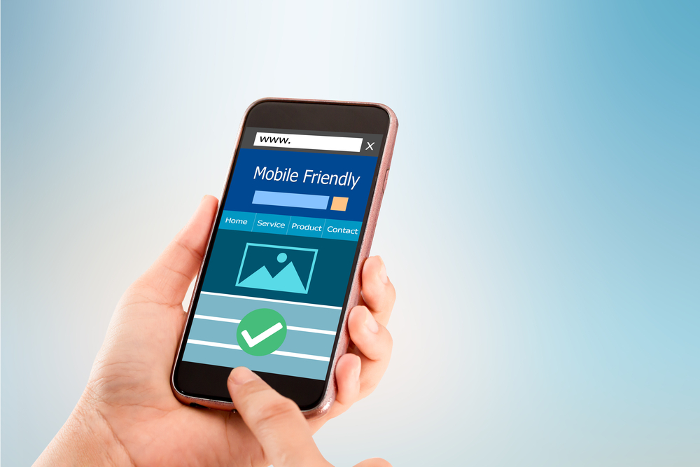
Understand the Importance of a Mobile-Friendly Website
Before we get started, let’s understand why a mobile-friendly website is essential. Aside from the fact that more people are using their mobile devices to browse the web, Google also uses mobile-friendliness as a ranking signal. This means that websites that aren’t optimized for mobile devices may not rank as highly in search results, potentially leading to less traffic and fewer customers.
Start with Responsive Design
Responsive design is a web design approach that ensures your website content adjusts seamlessly to fit any screen size. Whether your visitors are viewing your website on a desktop, laptop, tablet, or smartphone, they’ll have the same user-friendly experience. Most modern website builders and CMS platforms offer responsive templates, making it easy to create a site that works well on any device.
Prioritize Speed
Mobile users are usually on the go, which means they expect websites to load quickly. According to Google, approximately 53% of mobile site visits result in abandonment if page load times exceed three seconds. Optimize your images, minify your code, leverage browser caching, and reduce server response time to ensure your website loads quickly.
Make It Touch-Friendly
Unlike desktop users who use a mouse to navigate, mobile users rely on their fingers. This means your website needs to be touch-friendly. Ensure buttons are large enough to be easily tapped, and provide enough space between links to prevent the wrong one from being selected.
Keep Content Simple and Scannable
Mobile screens are smaller, which means you need to be more concise with your content. Use short paragraphs, bullet points, and subheadings to make your content easy to scan and understand. Also, ensure your font size is large enough to read without zooming in. Remember, less is more when it comes to mobile design.
Utilize Mobile Features
Take advantage of the features that are unique to mobile devices. For example, use GPS location services to show nearby stores or products, implement tap-to-call buttons for easy contact, or utilize push notifications to keep users updated on new content or promotions. These features can enhance the user experience and make your website stand out from others.
Test Your Mobile Website
Once you’ve designed your mobile website, it’s important to test it on various devices and browsers to ensure it works as intended. There are several tools available online, like Google’s Mobile-Friendly Test, that can help you identify any issues that need to be addressed.
Creating a mobile-friendly website may seem daunting, but with the right approach and tools, it’s entirely doable. By following these steps, you’ll be well on your way to creating a website that not only looks great on mobile devices but also provides a fantastic user experience.
At Denali & Associates, we understand the importance of having a mobile-friendly website. Our team of experts is dedicated to helping businesses like yours create websites that attract and convert customers, no matter what device they’re using.
Here are some great examples of mobile-friendly websites built by Denali & Associates.
Are you ready to take your website to the next level? Request a free strategy session with us today. We’ll discuss your business goals, evaluate your current website, and develop a plan to make your website more mobile-friendly. Don’t let the mobile revolution pass you by. Contact us at Denali & Associates to get started.